Frequent Music Ed Tech Talk guest and pal David MacDonald was recently on my Holiday Gift Guide episode of the show and mentioned the book Critique Is Creative, a book about Liz Lerman’s Critical Response Process.
From the book’s description page:
Devised by choreographer Liz Lerman in 1990, Critical Response Process® (CRP) is an internationally recognized method for giving and getting feedback on creative works in progress. In this first in-depth study of CRP, Lerman and her long-term collaborator John Borstel describe in detail the four-step process, its origins and principles. The book also includes essays on CRP from a wide range of contributors. With insight, ingenuity, and the occasional challenge, these practitioners shed light on the applications and variations of CRP in the contexts of art, education, and community life. Critique Is Creative examines the challenges we face in an era of reckoning and how CRP can aid in change-making of various kinds.
David and I got to talk about this process when he recently visited me while presenting on this very subject at the Teaching Composition Symposium at UMBC.
I really liked the idea of a methodical approach to providing more empathetic and consistent feedback to students, with detachment from emotion and ego. I picked up a copy and am eagerly reading for ideas I can integrate into my own teaching practices.
I encourage you to read David’s blog post about the book which includes the text of his presentation.
This is the text of a presentation I gave at the inaugural Teaching Composition Symposium at the University of Maryland, Baltimore County on 21 October 2022. I’m told presentations were video-recorded, so I’ll update this post later with that recording.
I’m sure you’ve had the experience of getting feedback on a composition that was well-meaning, but ultimately unhelpful. Even someone telling you how great your music was or how much they loved it is often frustrating because it’s hard to know what they heard that made them love it. Feedback that your music was mind-blowing and that your music was stomach-turning are equally unhelpful, because without more information, it’s impossible to learn something from this feedback.
In this presentation, I’ll talk about some of the common limitations of informal, unstructured feedback like this; and I’ll describe how I have used Liz Lerman’s Critical Response Process (CRP) to better support and motivate composers in my studio, and how you might implement it in yours.
In my previous experiences with critique sessions in studio classes, I found that the feedback offered usually said a lot more about the person offering it than it did about the music they were nominally responding to. Rather than suggesting how the composer might have written a work differently, this feedback often seems to answer the question “How would this piece have gone if I had written it, rather than you.” While I do think there should be space for composers to respectfully challenge one another’s creative intent, it is worth starting by identifying what that intent was to begin with. A better feedback system should assume that each composer in the room has a different set of musical goals and experiences.
I’ve got a new podcast episode out, and while it’s probably not in time for most of your shopping, the stuff we discussed are amongst my favorite things of 2022 and are certainly great ideas to treat yourself with down the road, if not sooner.
Show regulars Craig McClellan and Dr. David MacDonald join the show to talk about stuff we like.
Despite all the developments users have seen in music notation software and related technologies, the ways we actually get notes into the software hasn’t changed much in the last couple decades. Odla, an Italian music technology startup, is changing that with their new hardware controller for MuseScore and Dorico.
While other input devices rely on an instrument-style controller like a MIDI keyboard or “music alphabet” shortcuts on a computer keyboard, Odla directly models the five-line staff itself. The bright red staff-line buttons make Odla look pretty cool, and the connection between input and notation was obvious and intuitive from the moment the device hit my desk. As Odla’s tagline goes, it is “music you can touch”.
This device seems really interesting, and I like the idea of having MIDI input devices that embrace the visual nuances of staff notation.
David has an immeasurable amount of experience with notation software and gets straight to the point while testing this thing out. Check out the Odla here.
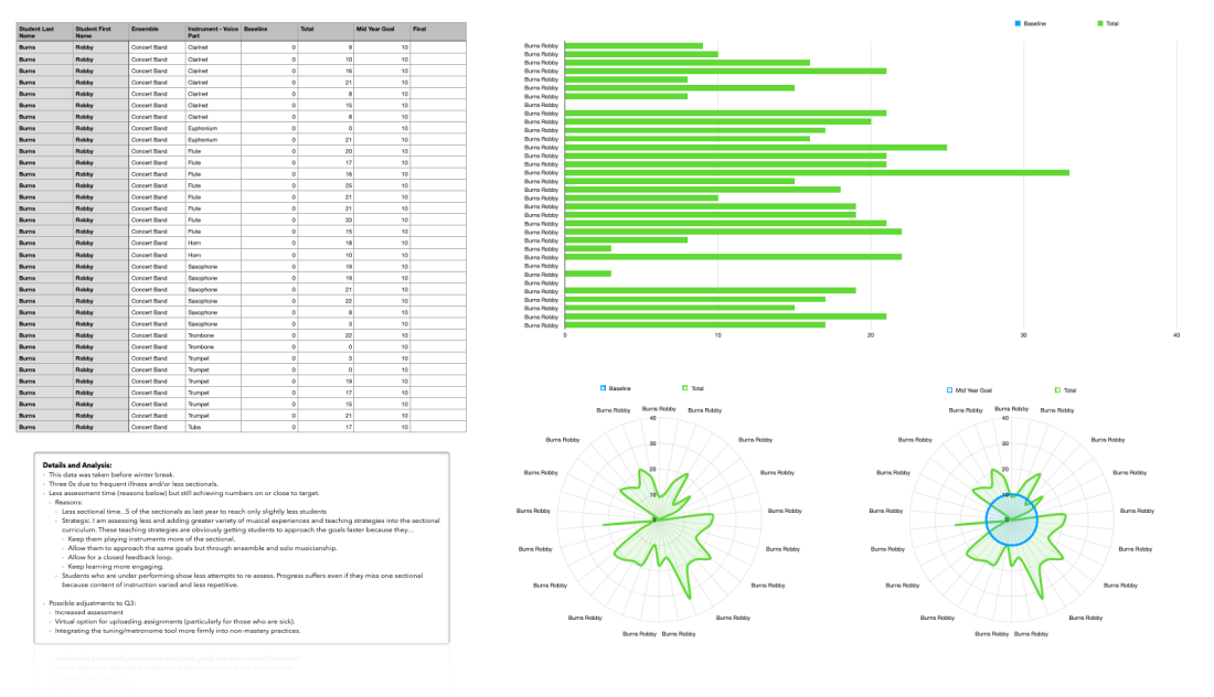
My current method for tracking student progress is a giant Numbers spreadsheet with clickable star icons for how many “stars” they earn on each performance. I am using Craft to give students more transparent, informal, and qualitative feedback about what they should be working on.
This same Numbers spreadsheet was able to pump out the above table, graph, and charts. Their graphical nature and intuitive ease allowed me to better understand my own shortcomings in this process and what resources, changes, and school supports I needed to make improvement. This helped me to construct a meaningful narrative in a recent SLO meeting.
I hope to cover Numbers and Craft in greater detail later on down the road, as well as my successes in teaching instrumental music performance at an individualized level. If you want more on this, I certainly recommend the hyperlinked podcast episodes above.
Tech Tip of the Year – Focus Modes (some discussion about how I am using these on episode 44 of this show) | camelcamelcamel.com | Use OBS for everything | Feedbin | Press and hold the spacebar on iOS to move your cursor around
Please don’t forget to rate the show and share it with others!
This blog post from David MacDonald, writing for Scoring Notes, has some great tips about making teaching documents and music worksheets using some of the most popular music notation software.
There is a lot music teachers can learn in this post, and from the associated podcast episode. Click the link below to read more.
If you have ever taught music lessons or classes, you have likely needed to share some small bit of music notation with your students that isn’t quite a full score or part, but still requires some amount of staff notation. Preparing this sort of document can be tricky because notation software is built around a certain set of assumptions suited for performance materials — scores and parts — which may not always serve learning materials like quizzes or scale sheets.
In this article, I’m going to cover some of the workflows, workarounds, best practices, and other considerations that I have used in preparing my own materials for the university music theory and composition courses I teach.
forScore has long been my most essential iPad app, and one of the few apps I consider iPad-first. This is to say that it is an app that takes specific advantage of the iPad’s strengths (form factor, pencil support, paper-like display, direct touch input) and leverages them in a way that makes the iPad feel essential.
For the same reasons it is essential on iPad, it has seemed slightly less essential on the iPhone (small screen size is impractical) and Mac (similarly, the design is not easy for direct manipulation, annotation, portability, or sticking on a music stand).
Still, an app this useful screams to be used cross-platform! The more I moved my sheet music library from PDFs on my hard drive to forScore, the more I found I needed to be able to work with the same library structure on my other devices. An iPhone is small, but there are those moments when it is the only device on you and you want to reference something really quickly. In a moment that my iPad battery once failed, I did conduct a percussion ensemble rehearsal from forScore on the iPhone.
In the same way that the iPhone is sometimes useful for being always the one in your pocket, the Mac is also useful sometimes. For example, file management is way easier on a Mac. No matter how many Mac features the iPad adds (drag and drop, Files app, etc.), it is simply not as easy as the Mac. Yes, the iPad can technically do the same things as the Mac in this regard, but it’s slower and more cumbersome. Furthermore, most users know how to use the Finder on Mac but don’t know how to work with the Files app on iPad, even though it is mostly the same these days.
<div class="
      image-block-outer-wrapper
      layout-caption-below
      design-layout-inline
      combination-animation-none
      individual-animation-none
      individual-text-animation-none
    ">


    <figure class="
          sqs-block-image-figure
          intrinsic
        " style="max-width:800px">


      <div class="image-block-wrapper">
        <div class="sqs-image-shape-container-element


          has-aspect-ratio
        " style="position: relative;padding-bottom:75.125%;overflow: hidden">


            <img src="https://images.squarespace-cdn.com/content/v1/5595df9ce4b0ce9ff9ecd1a8/1625925617918-12I7KK37KZGE9QZ2BWRR/CleanShot+2021-07-10+at+09.28.40.gif" alt="It is actually possible to open forScore and the Files app side by side on the iPad. From there, you can drag and drop multiple files at once from one app to another." width="800" height="601" style="display:block;object-fit: cover;width: 100%;height: 100%;object-position: 50% 50%" loading="lazy">

        </div>
      </div>


      <figcaption class="image-caption-wrapper">
        <div class="image-caption"><p class="">It is actually possible to open forScore and the Files app side by side on the iPad. From there, you can drag and drop multiple files at once from one app to another.</p></div>
      </figcaption>


    </figure>


</div>
I’d like to note that a year of teaching (mostly) online has sent me “back to the Mac,” so to speak. The Mac’s efficiency in multitasking, as well as its ability to run streaming apps like OBS and Loopback, has positioned it as my primary work device. Streaming forScore to my iPad’s screen to my Mac using OBS and AirServer is great, but it’s fiddly, indirect, and kills my iPad battery. It has become so much more direct to have forScore running right on the Mac, in the same place my other work is already happening.
<div class="
      image-block-outer-wrapper
      layout-caption-below
      design-layout-inline
      combination-animation-none
      individual-animation-none
      individual-text-animation-none
    ">


    <figure class="
          sqs-block-image-figure
          intrinsic
        " style="max-width:1112px">


      <div class="image-block-wrapper">
        <div class="sqs-image-shape-container-element


          has-aspect-ratio
        " style="position: relative;padding-bottom:69.51438903808594%;overflow: hidden">


            <img src="https://images.squarespace-cdn.com/content/v1/5595df9ce4b0ce9ff9ecd1a8/1625925592095-E3Y17P6LRN6XUVQBSZWX/CleanShot+2021-07-10+at+09.30.44.png" alt="In video conferencing apps like Zoom, I can now share music on the screen with my students directly, thanks to forScore running on my Mac." width="1112" height="773" style="display:block;object-fit: cover;width: 100%;height: 100%;object-position: 50% 50%" loading="lazy">

        </div>
      </div>


      <figcaption class="image-caption-wrapper">
        <div class="image-caption"><p class="">In video conferencing apps like Zoom, I can now share music on the screen with my students directly, thanks to forScore running on my Mac.</p></div>
      </figcaption>


    </figure>


</div>
The wait is over. Actually, it has been over since the fall. With the launch of macOS 11 Big Sur, forScore has released a universal version of their app on the Mac App Store. This means that it will be a free download for those who have purchased the app on iPad.
Note: I wrote most of this review fairly soon after release. Its scope is therefore more like what I would call “First Impressions.” I have been using it all school year long by the time I am actually posting this and think it is now more accurate to call it a review even though I will not be covering every detail comprehensively in the words below.
The goal of this review is to cover what’s unique about the Mac experience. If you want to learn more about forScore’s features, check out this excellent review by David MacDonald
For more on this subject (and speaking of David MacDonald), listen to my podcast review of forScore for Mac, where he was the guest.
Having forScore on the Mac is a huge deal for me. I have been using it aggressively since the fall. It is on a shared screen during every band class and private percussion lesson I teach. Using it right on the Mac is just as easy as I expected.
All of the buttons, knobs, bells, whistles and user interface elements are exactly where you would expect them to be because it looks and feels like the iPad app. I will get into the implications of that in a moment.
Adding music to my library is now a breeze. Until this point, I have been storing all of my scores in a folder in iCloud Drive and then creating duplicate copies in the iPad version of my forScore library. This means that to share music on my Mac’s screen (without doing the AirPlay method above), I have to open the files in PDF Expert. They don’t have any of my indexes, metadata, or attached recordings. I cannot annotate them as I can in forScore, or use music stamps, and I cannot see them in the context of my organized setlist. It is in some ways like maintaining two separate libraries of the same stuff.
To make matters worse, iCloud Drive periodically decides to put some of my scores back in the cloud when I am low on space. When this happens, and I try to open a score from the Spotlight, even a score I used the day before, I will have to wait an extra-long time for my Mac to download the file before actually opening it.
I am happy to report that forScore on the Mac resolves these frustrations. Not only is it lightning-fast for me to get all of the scores that were not in my forScore database inside of it, but scores can also now sync across devices over iCloud. Using keyboard shortcuts like Command+Clicking, Command+Tabbing, and the precision of the keyboard and mouse, allowed me to easily drag and drop most of my remaining digital sheet music library straight into forScore from the Finder. I never pushed forScore too hard in this regard, but at one point, I dragged about 40 scores into forScore from the Finder at once and it handled them with a breeze. This is something the iPad would occasionally crash while trying to do.
<div class="
      image-block-outer-wrapper
      layout-caption-below
      design-layout-inline
      combination-animation-none
      individual-animation-none
      individual-text-animation-none
    ">


    <figure class="
          sqs-block-image-figure
          intrinsic
        " style="max-width:800px">


      <div class="image-block-wrapper">
        <div class="sqs-image-shape-container-element


          has-aspect-ratio
        " style="position: relative;padding-bottom:62.5%;overflow: hidden">


            <img src="https://images.squarespace-cdn.com/content/v1/5595df9ce4b0ce9ff9ecd1a8/1625925693795-EPHCPH8HKUPPQ5MTUC4M/CleanShot+2021-07-10+at+09.23.47.gif" alt="The file import process I showed on the iPad above is far faster and more precise on macOS." width="800" height="500" style="display:block;object-fit: cover;width: 100%;height: 100%;object-position: 50% 50%" loading="lazy">

        </div>
      </div>


      <figcaption class="image-caption-wrapper">
        <div class="image-caption"><p class="">The file import process I showed on the iPad above is far faster and more precise on macOS.</p></div>
      </figcaption>


    </figure>


</div>
Because of this ease, finding duplicated, and deleting them was also easy. So was adding metadata. The Mac is now my preferred tool for doing this kind of logistic work in bulk.
Catalyst
forScore uses Apple’s Catalyst technology which means that Mac apps can share code with iPad apps. Apple introduced this at WWDC in 2019 and in the year that followed, relatively few apps made this transition. A notably good app using this technology is GoodNotes 5. They ditched their native Mac app in version 5 and decided to bring the iPad version over. GoodNotes is a good comparison to forScore, because its strength is, similarly, that it is a touch-first app that feels best when conceptualized as a digital “piece of paper.”
Catalyst apps can be automatically provided to the Mac by the developer with one press of a button, but they won’t be good experiences. Developers can do more work to have the app feel more like it belongs on the Mac, using things like the Touch Bar, custom Tool Bar elements, keyboard shortcuts, etc. The results have been lackluster. Still, having a Mac version of GoodNotes is better than not having one. And because it is an app I usually use on iPad, the need for the Mac version was more for reference.
<div class="
      image-block-outer-wrapper
      layout-caption-below
      design-layout-inline
      combination-animation-none
      individual-animation-none
      individual-text-animation-none
    ">


    <figure class="
          sqs-block-image-figure
          intrinsic
        " style="max-width:2466px">


      <div class="image-block-wrapper">
        <div class="sqs-image-shape-container-element


          has-aspect-ratio
        " style="position: relative;padding-bottom:70.39740753173828%;overflow: hidden">


            <img src="https://images.squarespace-cdn.com/content/v1/5595df9ce4b0ce9ff9ecd1a8/1625925921736-L6THJ0HVCWSCJ3NVTIU4/CleanShot+2021-07-10+at+09.33.20%402x.png" alt="GoodNotes 5 on the Mac. It looks good. But I am constantly forgetting whether to double or single tap on things because it behaves like an iPad app, but I have the conventions of a Mac hardwired into my brain when I am sitting in front of one." width="2466" height="1736" style="display:block;object-fit: cover;width: 100%;height: 100%;object-position: 50% 50%" loading="lazy">

        </div>
      </div>


      <figcaption class="image-caption-wrapper">
        <div class="image-caption"><p class="">GoodNotes 5 on the Mac. It looks good. But I am constantly forgetting whether to double or single tap on things because it behaves like an iPad app, but I have the conventions of a Mac hardwired into my brain when I am sitting in front of one.</p></div>
      </figcaption>


    </figure>


</div>


<div class="
      image-block-outer-wrapper
      layout-caption-below
      design-layout-inline
      combination-animation-none
      individual-animation-none
      individual-text-animation-none
    ">


    <figure class="
          sqs-block-image-figure
          intrinsic
        " style="max-width:2466px">


      <div class="image-block-wrapper">
        <div class="sqs-image-shape-container-element


          has-aspect-ratio
        " style="position: relative;padding-bottom:70.39740753173828%;overflow: hidden">


            <img src="https://images.squarespace-cdn.com/content/v1/5595df9ce4b0ce9ff9ecd1a8/1625925943296-PZECRR7DN8VCHN5QJDL6/CleanShot+2021-07-10+at+09.33.07%402x.png" alt="This is an even weirder example of an iPad toolbar on Mac, but it brings GoodNotes to my Mac, and for that I am grateful." width="2466" height="1736" style="display:block;object-fit: cover;width: 100%;height: 100%;object-position: 50% 50%" loading="lazy">

        </div>
      </div>


      <figcaption class="image-caption-wrapper">
        <div class="image-caption"><p class="">This is an even weirder example of an iPad toolbar on Mac, but it brings GoodNotes to my Mac, and for that I am grateful.</p></div>
      </figcaption>


    </figure>


</div>
At WWDC in 2020, Apple announced that more developer tools would be coming to Catalyst, so that it is easier to bring even more of the things that make Mac apps feel like Mac apps to your iPad version. They also announced that new Macs would be coming out (they shipped on November 17th) with new processors built by Apple. These new machines would be able to run native iOS apps without developers doing anything at all.
Steven Troughton Smith highlights these three methods on Twitter.
I imagine forScore went with the last of those three options for the Mac. Even though it feels like a mostly native experience, some things get weird.
With everything in macOS 11, it’s getting harder to define what Catalyst is. There are 3 forms:
• Unmodified iOS apps (Apple Silicon-only) • Traditional Catalyst apps (more Mac like, but blurry scaling) • Optimized for Mac/Mac Idiom Catalyst apps (pixel perfect, Mac controls)
There are things about forScore on Mac that “look” like the iPad and things that “behave” like the iPad. The things that look like iPad are more forgivable.
For example, the toolbar of an iPad app looks distinct from that of the Mac. Apple is attempting to blur this distinction by redesigning their stock apps to have buttons that are made of thin-lined graphics, rather than appearing as press-able buttons.
<div class="
      image-block-outer-wrapper
      layout-caption-below
      design-layout-inline
      combination-animation-none
      individual-animation-none
      individual-text-animation-none
    ">


    <figure class="
          sqs-block-image-figure
          intrinsic
        " style="max-width:660px">


      <div class="image-block-wrapper">
        <div class="sqs-image-shape-container-element


          has-aspect-ratio
        " style="position: relative;padding-bottom:6.363636016845703%;overflow: hidden">


            <img src="https://images.squarespace-cdn.com/content/v1/5595df9ce4b0ce9ff9ecd1a8/1625927574019-GM7BSBYVSPMU4JVA8HM1/CleanShot+2021-07-10+at+10.26.59.png" alt="The old macOS toolbar used to look like this." width="660" height="42" style="display:block;object-fit: cover;width: 100%;height: 100%;object-position: 50% 50%" loading="lazy">

        </div>
      </div>


      <figcaption class="image-caption-wrapper">
        <div class="image-caption"><p class="">The old macOS toolbar used to look like this.</p></div>
      </figcaption>


    </figure>


</div>


<div class="
      image-block-outer-wrapper
      layout-caption-below
      design-layout-inline
      combination-animation-none
      individual-animation-none
      individual-text-animation-none
    ">


    <figure class="
          sqs-block-image-figure
          intrinsic
        " style="max-width:2184px">


      <div class="image-block-wrapper">
        <div class="sqs-image-shape-container-element


          has-aspect-ratio
        " style="position: relative;padding-bottom:5.6776556968688965%;overflow: hidden">


            <img src="https://images.squarespace-cdn.com/content/v1/5595df9ce4b0ce9ff9ecd1a8/1625926010644-DXF4VPMDVEBHUUU8GOPP/CleanShot+2021-07-10+at+09.34.25%402x.png" alt="By contrast, iOS apps that are brought to the Mac with Catalyst have a toolbar that looks like this." width="2184" height="124" style="display:block;object-fit: cover;width: 100%;height: 100%;object-position: 50% 50%" loading="lazy">

        </div>
      </div>


      <figcaption class="image-caption-wrapper">
        <div class="image-caption"><p class="">By contrast, iOS apps that are brought to the Mac with Catalyst have a toolbar that looks like this.</p></div>
      </figcaption>


    </figure>


</div>


<div class="
      image-block-outer-wrapper
      layout-caption-below
      design-layout-inline
      combination-animation-none
      individual-animation-none
      individual-text-animation-none
    ">


    <figure class="
          sqs-block-image-figure
          intrinsic
        " style="max-width:2318px">


      <div class="image-block-wrapper">
        <div class="sqs-image-shape-container-element


          has-aspect-ratio
        " style="position: relative;padding-bottom:5.780845642089844%;overflow: hidden">


            <img src="https://images.squarespace-cdn.com/content/v1/5595df9ce4b0ce9ff9ecd1a8/1625926023520-5OPPPFE0T935YJ3UJVHZ/CleanShot+2021-07-10+at+09.35.00%402x.png" alt="The new macOS toolbar seeks to blur this distinction by bringing its own toolbar design closer to that of iPad apps." width="2318" height="134" style="display:block;object-fit: cover;width: 100%;height: 100%;object-position: 50% 50%" loading="lazy">

        </div>
      </div>


      <figcaption class="image-caption-wrapper">
        <div class="image-caption"><p class="">The new macOS toolbar seeks to blur this distinction by bringing its own toolbar design closer to that of iPad apps.</p></div>
      </figcaption>


    </figure>


</div>
iOS apps also have different pop-over style elements that feature a Cancel button in the upper left and a Done button in the upper right. These don’t feel Mac-like but they get the job done. You can, for example, still press Escape to dismiss them like you can on a Mac, though the difference in user interface might suggest otherwise.
<div class="
      image-block-outer-wrapper
      layout-caption-below
      design-layout-inline
      combination-animation-none
      individual-animation-none
      individual-text-animation-none
    ">


    <figure class="
          sqs-block-image-figure
          intrinsic
        " style="max-width:1582px">


      <div class="image-block-wrapper">
        <div class="sqs-image-shape-container-element


          has-aspect-ratio
        " style="position: relative;padding-bottom:128.06573486328125%;overflow: hidden">


            <img src="https://images.squarespace-cdn.com/content/v1/5595df9ce4b0ce9ff9ecd1a8/1625926353940-01RZ0O2TIHUM2W052HPV/CleanShot+2021-07-10+at+10.11.24%402x.png" alt="Alerts and settings screens trip me up with Catalyst apps because they really make me feel like I am using an iPad." width="1582" height="2026" style="display:block;object-fit: cover;width: 100%;height: 100%;object-position: 50% 50%" loading="lazy">

        </div>
      </div>


      <figcaption class="image-caption-wrapper">
        <div class="image-caption"><p class="">Alerts and settings screens trip me up with Catalyst apps because they <em>really</em> make me feel like I am using an iPad.</p></div>
      </figcaption>


    </figure>


</div>


<div class="
      image-block-outer-wrapper
      layout-caption-below
      design-layout-inline
      combination-animation-none
      individual-animation-none
      individual-text-animation-none
    ">


    <figure class="
          sqs-block-image-figure
          intrinsic
        " style="max-width:1674px">


      <div class="image-block-wrapper">
        <div class="sqs-image-shape-container-element


          has-aspect-ratio
        " style="position: relative;padding-bottom:71.68458557128906%;overflow: hidden">


            <img src="https://images.squarespace-cdn.com/content/v1/5595df9ce4b0ce9ff9ecd1a8/1625926372271-7XBJJL36WU5ENAIJ9M5M/CleanShot+2021-07-10+at+10.11.46%402x.png" alt="By contrast, here is the user interface of the OmniFocus settings screen, which follows native Mac app conventions." width="1674" height="1200" style="display:block;object-fit: cover;width: 100%;height: 100%;object-position: 50% 50%" loading="lazy">

        </div>
      </div>


      <figcaption class="image-caption-wrapper">
        <div class="image-caption"><p class="">By contrast, here is the user interface of the OmniFocus settings screen, which follows native Mac app conventions.</p></div>
      </figcaption>


    </figure>


</div>
Here are some other details and quirks that highlight the varying degrees of success that forScore has at being Mac-like…
Window resizing
Windows can be resized on Mac. This is implemented pretty well in forScore. When the window is dragged to certain dimensions, the score will automatically decide if it is better to fit one or two pages of the score on the screen. As with an iPad, you can click the book-looking button to the left of the file’s title to force it to keep two pages on screen, regardless of window size. Tools in the toolbar also automatically disappear at smaller window sizes and reappear at larger ones.
<div class="
      image-block-outer-wrapper
      layout-caption-below
      design-layout-inline
      combination-animation-none
      individual-animation-none
      individual-text-animation-none
    ">


    <figure class="
          sqs-block-image-figure
          intrinsic
        " style="max-width:800px">


      <div class="image-block-wrapper">
        <div class="sqs-image-shape-container-element


          has-aspect-ratio
        " style="position: relative;padding-bottom:72.125%;overflow: hidden">


            <img src="https://images.squarespace-cdn.com/content/v1/5595df9ce4b0ce9ff9ecd1a8/1625926073403-R9CJPA55LPPTLYG3XY50/CleanShot+2021-07-10+at+09.36.12.gif" alt="forScore can do things on Mac it can’t do on iPad, like window resizing!" width="800" height="577" style="display:block;object-fit: cover;width: 100%;height: 100%;object-position: 50% 50%" loading="lazy">

        </div>
      </div>


      <figcaption class="image-caption-wrapper">
        <div class="image-caption"><p class="">forScore can do things on Mac it can’t do on iPad, like window resizing!</p></div>
      </figcaption>


    </figure>


</div>
Menu bar
The Mac has the menu bar which exposes (in well-made software) all of the available actions in the app. This helps with discoverability and customization. Users can always find what they want from the menu bar and can set menu bar items as keyboard shortcuts in the System Preferences app. It is nice to see many of forScore’s options in the menu bar, but I am not certain that all of them are there. Fortunately, forScore for Mac has an area in settings that allows you to customize keyboard shortcuts for many of the app’s features.
<div class="
      image-block-outer-wrapper
      layout-caption-below
      design-layout-inline
      combination-animation-none
      individual-animation-none
      individual-text-animation-none
    ">


    <figure class="
          sqs-block-image-figure
          intrinsic
        " style="max-width:983px">


      <div class="image-block-wrapper">
        <div class="sqs-image-shape-container-element


          has-aspect-ratio
        " style="position: relative;padding-bottom:82.80773162841797%;overflow: hidden">


            <img src="https://images.squarespace-cdn.com/content/v1/5595df9ce4b0ce9ff9ecd1a8/1625925996474-FBX5YWUGJMS2ONEK8SDA/CleanShot+2021-07-09+at+09.39.48.png" alt="You can set up custom keyboard shortcuts in forScore." width="983" height="814" style="display:block;object-fit: cover;width: 100%;height: 100%;object-position: 50% 50%" loading="lazy">

        </div>
      </div>


      <figcaption class="image-caption-wrapper">
        <div class="image-caption"><p class="">You can set up custom keyboard shortcuts in forScore.</p></div>
      </figcaption>


    </figure>


</div>
Page navigation
It’s really weird. Simply put, page navigation conventions that work on iPad do not always translate to the Mac. For example, touching and dragging the screen to turn pages is natural when you use your hand to turn the pages, but less so with a keyboard and mouse. Common Mac conventions like two-finger scrolling to swipe pages are implemented in forScore. But other things are weird. Two-finger scrolling feels more natural in other document-based apps like, for example, Preview. In forScore, you can pinch to zoom, but pages that are zoomed in larger than the window size take extra page-turning gestures to navigate. This if because forScore’s default behavior when you swipe is to show you whatever of the page is not on the display. This makes sense because in a performance you might want to zoom in closer to the music. When doing this, it makes sense that a one-touch gesture reveals the next part of the music (regardless of what page it is on), but in practice, this is not Mac-like. Any other app that deals with PDFs would show me the next page when I do the page turn gesture. This quirk is particularly weird if your score is just a few pixels taller than the window size you have set. Turning the page takes two swipes instead of one. The first swipe awkwardly jolts the screen down just enough to see the few missing pixels at the bottom of the screen, and the next swipe actually turns the page.
<div class="
      image-block-outer-wrapper
      layout-caption-below
      design-layout-inline
      combination-animation-none
      individual-animation-none
      individual-text-animation-none
    ">


    <figure class="
          sqs-block-image-figure
          intrinsic
        " style="max-width:625px">


      <div class="image-block-wrapper">
        <div class="sqs-image-shape-container-element


          has-aspect-ratio
        " style="position: relative;padding-bottom:128%;overflow: hidden">


            <img src="https://images.squarespace-cdn.com/content/v1/5595df9ce4b0ce9ff9ecd1a8/1625926106078-YBOGTZI6YTS3LX4EQURA/CleanShot+2021-07-10+at+09.40.48.gif" alt="When my window is just too short, I have to turn the page twice, to turn it once. These kinds of quirks aren’t terrible, but when you encounter them, it’s easy to perceive the app as broken or untrustworthy." width="625" height="800" style="display:block;object-fit: cover;width: 100%;height: 100%;object-position: 50% 50%" loading="lazy">

        </div>
      </div>


      <figcaption class="image-caption-wrapper">
        <div class="image-caption"><p class="">When my window is just too short, I have to turn the page twice, to turn it once. These kinds of quirks aren’t terrible, but when you encounter them, it’s easy to perceive the app as broken or untrustworthy.</p></div>
      </figcaption>


    </figure>


</div>
Zooming in and out
The above-mentioned quirk is even weirder when you have zoomed in a lot. I do this often to focus my students on a particular excerpt of music. When scrolled in, there is (to my knowledge) no way to keep scrolling from the trackpad. You have to zoom out, turn the page, and then zoom in again. Contrast this with Preview, a native Mac app, which will just let me scroll freely through the document, no matter how far I have zoomed in.
Spotlight!
I am pleased to say that searching for score files in Spotlight (Command+Spacebar) results in all my scores showing up, even chapter titles in an index of a larger score.
Mac apps tend to have sidebars that reveal list views and top-levels of organization hierarchy in an app. These can often be toggled on and off though I usually leave them on so I can get to things more quickly. forScore on the Mac supports the option to keep the sidebar permanently visible, so you can always see your library alongside whatever score is selected. Cool.
<div class="
      image-block-outer-wrapper
      layout-caption-below
      design-layout-inline
      combination-animation-none
      individual-animation-none
      individual-text-animation-none
    ">


    <figure class="
          sqs-block-image-figure
          intrinsic
        " style="max-width:3360px">


      <div class="image-block-wrapper">
        <div class="sqs-image-shape-container-element


          has-aspect-ratio
        " style="position: relative;padding-bottom:62.5%;overflow: hidden">


            <img src="https://images.squarespace-cdn.com/content/v1/5595df9ce4b0ce9ff9ecd1a8/1625928115026-OIGE0M403046LJKCTLEJ/CleanShot+2021-07-10+at+09.19.11%402x.png" alt="I like that the Mac version of forScore supports a permanently-visible left sidebar. I wouldn’t mind this feature on my 12.9 inch iPad Pro." width="3360" height="2100" style="display:block;object-fit: cover;width: 100%;height: 100%;object-position: 50% 50%" loading="lazy">

        </div>
      </div>


      <figcaption class="image-caption-wrapper">
        <div class="image-caption"><p class="">I like that the Mac version of forScore supports a permanently-visible left sidebar. I wouldn’t mind this feature on my 12.9 inch iPad Pro.</p></div>
      </figcaption>


    </figure>


</div>
Conclusion
There are of course more Mac-like things to celebrate and more iPad-like things to question, but the bottom line is this: forScore is an app loved by musicians all over, and it is completely stellar that the developers dedicated time to bringing this application over. It is unknown if it would ever have happened without Apple’s Catalyst technology, but because of it, we get to have a pretty ok Mac app, where we otherwise would not. And having a pretty ok Mac version of an indispensable iPad app is… actually great! So thank you forScore team!
There are certainly more Mac apps that I would love to see on iOS than there are iOS apps I would like to see on the Mac, but the list is getting smaller.
Its been a busy few weeks as I have been wrapping up the end of a tough school year. While I am late to getting this week’s podcast episode out, I have been working on this site and have a bunch of content to share in the coming week.
I managed to sneak in enough time during the last week of school to watch Apple’s WWDC Keynote and to talk about it on Music Ed Tech Talk with Craig McClellan (cohost of my other podcast, The Class Nerd).
It was an opportunity to take a nice break from the challenging end-of-year procedures, and to think about how Apple’s fall software updates will impact how I get work done in the classroom. Listen below.
Robby and Craig break down the announcements from Apple’s Word Wide Developer Conference and discuss how teachers might use the upcoming features to their latest software updates.
I am often asked where I go to learn about technology.
The truth is that most of it comes through a few blogs and podcasts. I don’t listen to many podcasts that deal specifically with integrating technology into the music classroom, though there are a few good ones. (Aside from my own, I recommend Katie Wardrobe’s show Music Tech Teacher and MusicFirst’s Profiles in Music Teaching with Technology.)
I don’t listen to prescriptive “how-to” shows. I focus more on industry analysis, details of hardware and software features, and extended discussion. My favorite shows are conversational in tone rather than the hyper-produced style of the modern-day shows that NPR has popularized.
I find this style of show to be far more listenable and engaging while giving me a deeper and underlying understanding of the technology I use. This way, I am more empowered to adapt the technology I have to my unique professional challenges and lifestyle.
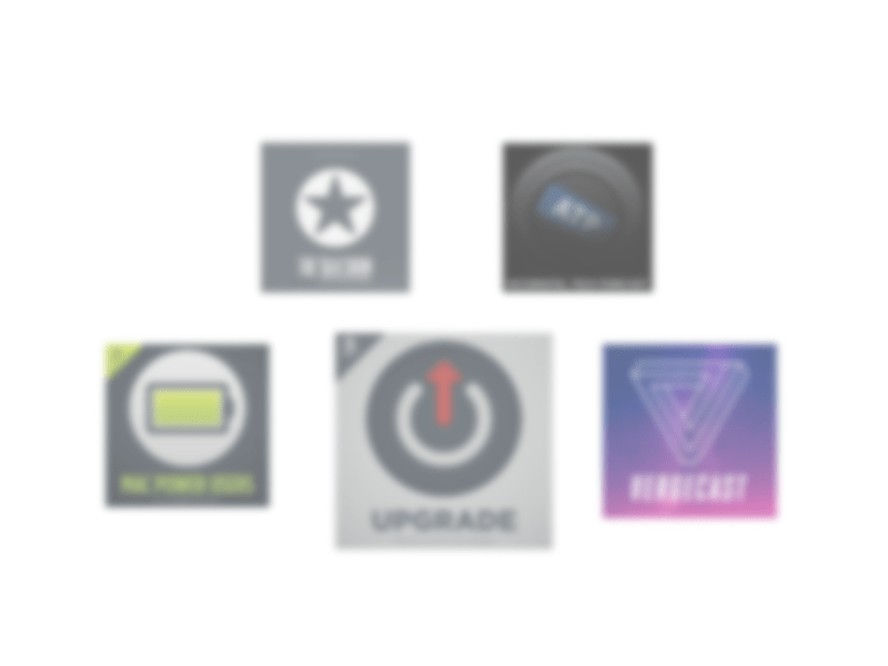
Here are my six favorites…
Upgrade
Probably my most listened show. Heavily focused on Apple technologies, news, and the streaming media landscape. The show is deeply informative but also has some produced elements like theme music and segments, which keep each episode moving at an engaging pace.
Here is a recent episode where the hosts review the new M1 iMacs and M1 iPad:
The Vergecast
The Verge is a great website for learning about all things in consumer tech. Their podcast is the most produced on this list, but the camaraderie between speakers allows for the ideas to present as looser and more raw than they do in written articles.
I have been considering an electric vehicle lately and enjoyed this episode about recent EUVs:
Mac Power Users
This show delivers tips for making the most of your computing devices each week. It includes pro tips, app recommendations, and interviews with professionals spanning many industries. Listening to MPU is one of the inspirations for my book, as it focuses on not just the tools, but how to implement them creatively.
If you are looking for a place to start, check out Music Ed Tech Talk frequent guest, David MacDonald, on this episode of Mac Power Users:
The Talk Show
John Gruber’s The Talk Show is one of the shows that made me love podcasting. Though episodes are inconsistent in length, scope, and irregularly released, Gruber and his guests always have engaging discussion. So much so that I don’t mind rants about sports, politics, and other “off-topic” diversions. This show is in some respects a prototype for the kinds of discussions I like to have on my podcast. Personal, detailed, and analytical.
Accidental Tech Podcast
Also very Apple-focused, but with more perspective on software development and adjacent technologies. This show is lengthy and more unstructured but also very deep. The three hosts are in software development and sometimes talk about topics that are just on the outside of my wheelhouse, but I am still able to follow along. The perspective of these hosts has strongly influenced the kind of quality and detail I expect from my technology.
This episode is a fan favorite, and gives you an insight into the kind of detail the hosts cover, and also their relationship:
Dithering
This is a paid show. For me, it is worth the $5 a month because it includes John Gruber from The Talk Show with one of my favorite of his reoccurring guests, Ben Thompson, who is a brilliant technology analyst. Two 15-minute episodes are released each week. The tight format keeps the discussion fast and rich.


You must be logged in to post a comment.