Staying On Top of Teaching Responsibilities with OmniFocus Perspectives (OmniFocus Mini-Series)

Teaching is a challenging, multifaceted career. I never end a day feeling like I accomplished everything I was supposed to. But sometimes, software can help! And for my tasks, that software is OmniFocus. 

Most of the checkable todo items in my life go in OmniFocus. It is a powerful task app for Mac, iOS, and Apple Watch that is based on David Allen’s “Getting Things Done” methodology. There are 100 reasons I love it. Lately, it’s because I am getting a lot of mileage out of the Perspective feature. Perspectives allow you to build different custom views for how OmniFocus displays your tasks.

<div class="
      image-block-outer-wrapper
      layout-caption-below
      design-layout-inline
      combination-animation-none
      individual-animation-none
      individual-text-animation-none
    ">


    <figure class="
          sqs-block-image-figure
          intrinsic
        " style="max-width:2500px">


      <div class="image-block-wrapper">
        <div class="sqs-image-shape-container-element


          has-aspect-ratio
        " style="position: relative;padding-bottom:66.91999816894531%;overflow: hidden">


            <img src="https://images.squarespace-cdn.com/content/v1/5595df9ce4b0ce9ff9ecd1a8/1591740426076-RKWIWZW86K7S4E8K89RJ/1.png" alt="The Forecast Perspective comes installed on OmniFocus. It shows you a convenient day at a glance so that you never need to stress about todos until the day they are due." width="2500" height="1673" style="display:block;object-fit: cover;width: 100%;height: 100%;object-position: 50% 50%" loading="lazy">

        </div>
      </div>


      <figcaption class="image-caption-wrapper">
        <div class="image-caption"><p class="">The Forecast Perspective comes installed on OmniFocus. It shows you a convenient day at a glance so that you never need to stress about todos until the day they are due.</p></div>
      </figcaption>


    </figure>


</div>

A Perspective is kind of like a custom search that you can save. The building blocks will seem similar if you have ever made an email rule.

I have over 1,000 tasks in OmniFocus. My goal with Perspectives is to create windows into my work that empower me to think only about the things that are relevant to me at a given time or in a given situation. 

Here are a few Perspectives that are most useful to me. 
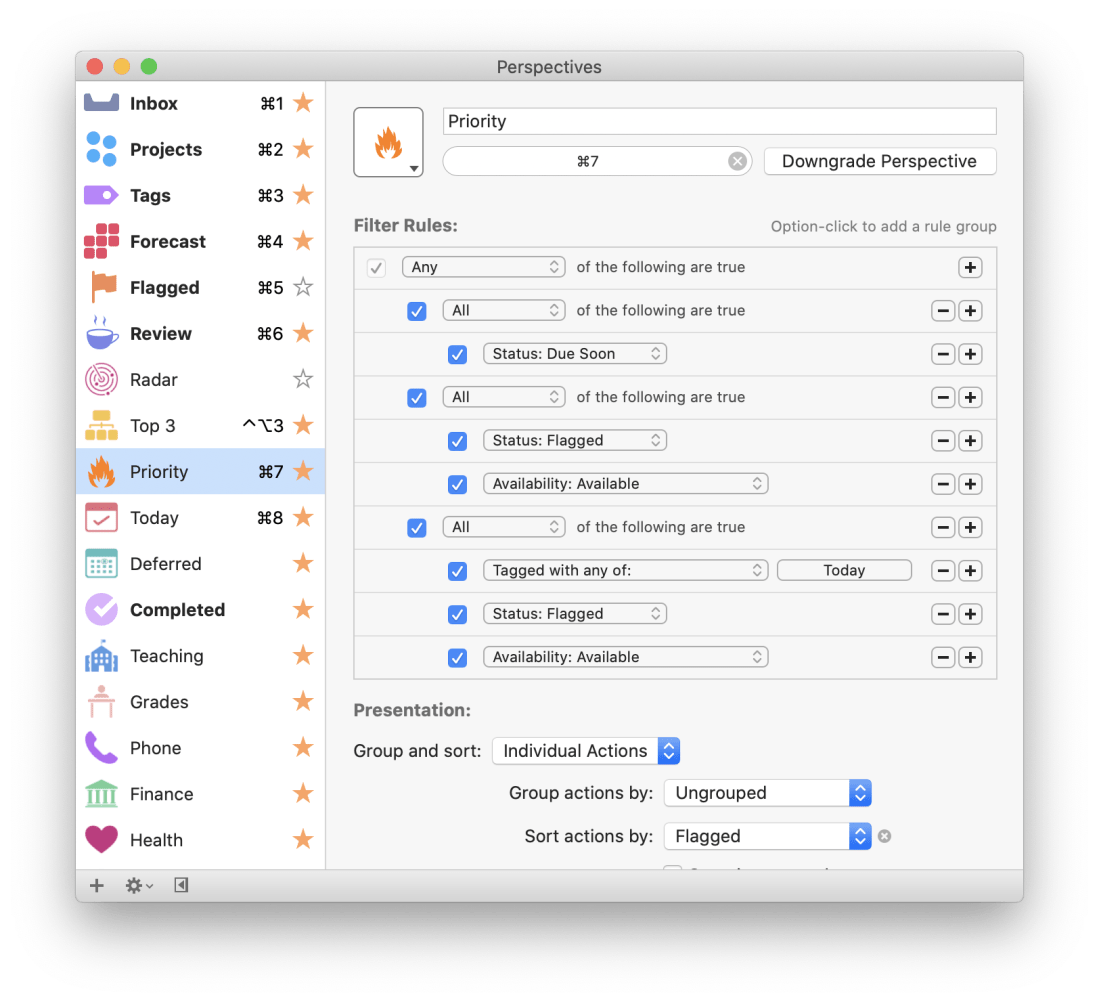
Priority

<div class="
      image-block-outer-wrapper
      layout-caption-below
      design-layout-inline
      combination-animation-none
      individual-animation-none
      individual-text-animation-none
    ">


    <figure class="
          sqs-block-image-figure
          intrinsic
        " style="max-width:1405px">


      <div class="image-block-wrapper">
        <div class="sqs-image-shape-container-element


          has-aspect-ratio
        " style="position: relative;padding-bottom:92.88256072998047%;overflow: hidden">


            <img src="https://images.squarespace-cdn.com/content/v1/5595df9ce4b0ce9ff9ecd1a8/1591740553183-YOHTYFY9LQRW134K14WP/2+-+priority.png" alt="The Priority Perspective filters only items that are due soon or that are high priority items I want to be working on for the day. OmniFocus highlights flagged tasks with an orange ring and due tasks with a yellow ring to draw your attention." width="1405" height="1305" style="display:block;object-fit: cover;width: 100%;height: 100%;object-position: 50% 50%" loading="lazy">

        </div>
      </div>


      <figcaption class="image-caption-wrapper">
        <div class="image-caption"><p class="">The Priority Perspective filters only items that are due soon or that are high priority items I want to be working on for the day. OmniFocus highlights flagged tasks with an orange ring and due tasks with a yellow ring to draw your attention.</p></div>
      </figcaption>


    </figure>


</div>

This Perspective shows me all of my most important tasks. I designed it for moments where I have an overwhelming number of things to do spanning numerous unrelated projects and I just need to focus on the things I can’t survive the day (or moment) without doing. This Perspective is set up to show only tasks that are due soon, overdue, and tasks that are both tagged ‘Today’ and have a flag. The result is a list of tasks that are due soon mixed in with the most important things I want to be working on ‘today.’ 

<div class="
      image-block-outer-wrapper
      layout-caption-below
      design-layout-inline
      combination-animation-none
      individual-animation-none
      individual-text-animation-none
    ">


    <figure class="
          sqs-block-image-figure
          intrinsic
        " style="max-width:1779px">


      <div class="image-block-wrapper">
        <div class="sqs-image-shape-container-element


          has-aspect-ratio
        " style="position: relative;padding-bottom:91.90556335449219%;overflow: hidden">


            <img src="https://images.squarespace-cdn.com/content/v1/5595df9ce4b0ce9ff9ecd1a8/1591740714885-XSMTEMH3SITH76XDCEDH/3+-+priotiry+set+up.png" alt="This is how my Priority Perspective is set up." width="1779" height="1635" style="display:block;object-fit: cover;width: 100%;height: 100%;object-position: 50% 50%" loading="lazy">

        </div>
      </div>


      <figcaption class="image-caption-wrapper">
        <div class="image-caption"><p class="">This is how my Priority Perspective is set up.</p></div>
      </figcaption>


    </figure>


</div>

There are usually only a few tasks that result from this search which helps my eyes (and brain) focus on top priorities.

Today

This is a project that filters only items with the tag ‘Today.’ These items already show up on my Forecast view alongside overdue and due soon items, but there are times where I do not have any items due that day, or where I they aren’t available yet, resulting in a cluttered looking Forecast. The Today Perspective shows me only a list of things I want to be working on Today, organized by project.

<div class="
      image-block-outer-wrapper
      layout-caption-below
      design-layout-inline
      combination-animation-none
      individual-animation-none
      individual-text-animation-none
    ">


    <figure class="
          sqs-block-image-figure
          intrinsic
        " style="max-width:2289px">


      <div class="image-block-wrapper">
        <div class="sqs-image-shape-container-element


          has-aspect-ratio
        " style="position: relative;padding-bottom:81.3018798828125%;overflow: hidden">


            <img src="https://images.squarespace-cdn.com/content/v1/5595df9ce4b0ce9ff9ecd1a8/1591740869969-CL1FMPJD11IEWLV4B2YR/4+-+today.png" alt="This is my Today Perspective. It is similar to the Forecast, only tasks don’t necessarily need to be due to show up here, and it is organized by project. See an image of my Forecast at the top of this post." width="2289" height="1861" style="display:block;object-fit: cover;width: 100%;height: 100%;object-position: 50% 50%" loading="lazy">

        </div>
      </div>


      <figcaption class="image-caption-wrapper">
        <div class="image-caption"><p class="">This is my Today Perspective. It is similar to the Forecast, only tasks don’t necessarily need to be due to show up here, and it is organized by project. See an image of my Forecast at the top of this post.</p></div>
      </figcaption>


    </figure>


</div>


<div class="
      image-block-outer-wrapper
      layout-caption-below
      design-layout-inline
      combination-animation-none
      individual-animation-none
      individual-text-animation-none
    ">


    <figure class="
          sqs-block-image-figure
          intrinsic
        " style="max-width:1779px">


      <div class="image-block-wrapper">
        <div class="sqs-image-shape-container-element


          has-aspect-ratio
        " style="position: relative;padding-bottom:91.90556335449219%;overflow: hidden">


            <img src="https://images.squarespace-cdn.com/content/v1/5595df9ce4b0ce9ff9ecd1a8/1591740916886-2PYLIZB0N84LQFWPSHGE/5+-+today+set+up.png" alt="This is how my Today Perspective is set up." width="1779" height="1635" style="display:block;object-fit: cover;width: 100%;height: 100%;object-position: 50% 50%" loading="lazy">

        </div>
      </div>


      <figcaption class="image-caption-wrapper">
        <div class="image-caption"><p class="">This is how my Today Perspective is set up.</p></div>
      </figcaption>


    </figure>


</div>

Deferred

This Perspective shows me when certain items became available to begin working on, in the order that they became available. This is useful for seeing if there are tasks that became available a long time ago that I am really slacking on, or maybe that I need to drop and admit I took on too much. 

<div class="
      image-block-outer-wrapper
      layout-caption-below
      design-layout-inline
      combination-animation-none
      individual-animation-none
      individual-text-animation-none
    ">


    <figure class="
          sqs-block-image-figure
          intrinsic
        " style="max-width:2289px">


      <div class="image-block-wrapper">
        <div class="sqs-image-shape-container-element


          has-aspect-ratio
        " style="position: relative;padding-bottom:81.3018798828125%;overflow: hidden">


            <img src="https://images.squarespace-cdn.com/content/v1/5595df9ce4b0ce9ff9ecd1a8/1591740987077-EOSZ16AN3VEIQG0XEIF3/6+-+deferred.png" alt="My Deferred Perspective. Tip - Giving an item a Defer date in OmniFocus means that it isn’t available to work on until that date. You can use these to easily filter only items that are ‘available,’ which can relieve the stress of seeing everything a…" width="2289" height="1861" style="display:block;object-fit: cover;width: 100%;height: 100%;object-position: 50% 50%" loading="lazy">

        </div>
      </div>


      <figcaption class="image-caption-wrapper">
        <div class="image-caption"><p class="">My Deferred Perspective. Tip - Giving an item a Defer date in OmniFocus means that it isn’t available to work on until that date. You can use these to easily filter only items that are ‘available,’ which can relieve the stress of seeing everything at once.</p></div>
      </figcaption>


    </figure>


</div>

Teaching

I have numerous projects relating to teaching in the Howard County Public School System. I have action lists for each of my ensembles, for directing the HCPSS Honor Band, for planning concerts, field trips, and for articulating our students from middle to high school. The Teaching Perspective focuses me on only the tasks related to teaching responsibilities, and organizes them by due date. This way I am thinking about only work tasks, while remaining focused on the next task I should be completing.

<div class="
      image-block-outer-wrapper
      layout-caption-below
      design-layout-inline
      combination-animation-none
      individual-animation-none
      individual-text-animation-none
    ">


    <figure class="
          sqs-block-image-figure
          intrinsic
        " style="max-width:2289px">


      <div class="image-block-wrapper">
        <div class="sqs-image-shape-container-element


          has-aspect-ratio
        " style="position: relative;padding-bottom:81.3018798828125%;overflow: hidden">


            <img src="https://images.squarespace-cdn.com/content/v1/5595df9ce4b0ce9ff9ecd1a8/1591741154885-71XPVMNBWMOYKZJ2TJ2N/7+-+teaching.png" alt="My Teaching Perspective shows only Howard County Public School System responsibilities. This is really useful for when I need to focus only on work." width="2289" height="1861" style="display:block;object-fit: cover;width: 100%;height: 100%;object-position: 50% 50%" loading="lazy">

        </div>
      </div>


      <figcaption class="image-caption-wrapper">
        <div class="image-caption"><p class="">My Teaching Perspective shows only Howard County Public School System responsibilities. This is really useful for when I need to focus only on work.</p></div>
      </figcaption>


    </figure>


</div>

Grading

My school uses Canvas for grading students and Synergy for tracking certain data on them. Both are slow, web-based, programs that take a while to load. For this reason, I tend to want to spend concentrated times working with grades and then ignore them, rather than being constantly in and out of the grade book.

For this reason, I add a lot of grade based tasks to OmniFocus and tag them with keywords like Grades, Canvas, or Synergy. I tend to use these a lot when triaging email. For example, if my school’s data clerk emails teachers with due dates and deadlines for final grades, I forward that into my OmniFocus inbox using my special email address that the app provides. Once it is out of my email inbox and into my OmniFocus inbox I give it a defer date and a due date, and tag it with the tag ‘Canvas.’

Sometimes students email me work if they have issues submitting it on Canvas. Or parents ask me questions in email about certain grades. In these situations, I forward the emails into my OmniFocus inbox and then tag them with the necessary tag. 

The Grades Perspective aggregates all of these tags into one view. This is useful because these tasks rarely have hard due dates. By not assigning them due dates, they never clutter up my Forecast perspective (where I spend most of my time). When I am ready to focus on grading, I can open up this Perspective and filter all other tasks out.

<div class="
      image-block-outer-wrapper
      layout-caption-below
      design-layout-inline
      combination-animation-none
      individual-animation-none
      individual-text-animation-none
    ">


    <figure class="
          sqs-block-image-figure
          intrinsic
        " style="max-width:2292px">


      <div class="image-block-wrapper">
        <div class="sqs-image-shape-container-element


          has-aspect-ratio
        " style="position: relative;padding-bottom:84.55497741699219%;overflow: hidden">


            <img src="https://images.squarespace-cdn.com/content/v1/5595df9ce4b0ce9ff9ecd1a8/1591741229683-BK8A9OWB5Z37O9BIDEOC/8+-+grades.png" alt="The Grades Perspective shows only responsibilities that involve entering grades and working with my school’s learning management software." width="2292" height="1938" style="display:block;object-fit: cover;width: 100%;height: 100%;object-position: 50% 50%" loading="lazy">

        </div>
      </div>


      <figcaption class="image-caption-wrapper">
        <div class="image-caption"><p class="">The Grades Perspective shows only responsibilities that involve entering grades and working with my school’s learning management software.</p></div>
      </figcaption>


    </figure>


</div>

Top 3

Sometimes I get so overwhelmed that I just need to think “what are three things that I need to focus on today.” This usually happens on days where I need to be spending long periods of serious focus on one or more broad tasks. I often go traditional-task-list and break out a pencil and paper for moments like this. Lately, I use this OmniFocus Perspective called Top 3. I have a tag called “1,” “2,” and “3.” All this Perspective does is filter them so that I don’t see anything else.

<div class="
      image-block-outer-wrapper
      layout-caption-below
      design-layout-inline
      combination-animation-none
      individual-animation-none
      individual-text-animation-none
    ">


    <figure class="
          sqs-block-image-figure
          intrinsic
        " style="max-width:1302px">


      <div class="image-block-wrapper">
        <div class="sqs-image-shape-container-element


          has-aspect-ratio
        " style="position: relative;padding-bottom:58.986175537109375%;overflow: hidden">


            <img src="https://images.squarespace-cdn.com/content/v1/5595df9ce4b0ce9ff9ecd1a8/1592438097674-N72CYJNU5FVBQDUSTETR/CleanShot+2020-06-17+at+19.52.03%402x.png" alt="CleanShot 2020-06-17 at 19.52.03@2x.png" width="1302" height="768" style="display:block;object-fit: cover;width: 100%;height: 100%;object-position: 50% 50%" loading="lazy">

        </div>
      </div>


    </figure>


</div>

Icons

OmniFocus Perspectives can be given a custom icon that matches the style of the perspective icons that come with the app. I am able to make my Perspectives look really attractive and eye-grabbing with the MacStories Perspective Icons, a new product that features 20,000 icons for OmniFocus. You can read more about them and buy them here

<div class="
      image-block-outer-wrapper
      layout-caption-below
      design-layout-inline
      combination-animation-none
      individual-animation-none
      individual-text-animation-none
    ">


    <figure class="
          sqs-block-image-figure
          intrinsic
        " style="max-width:1532px">


      <div class="image-block-wrapper">
        <div class="sqs-image-shape-container-element


          has-aspect-ratio
        " style="position: relative;padding-bottom:45.430809020996094%;overflow: hidden">


            <img src="https://images.squarespace-cdn.com/content/v1/5595df9ce4b0ce9ff9ecd1a8/1591741346555-RWSMZXTX68YP86IHURPM/9+-+macstories.png" alt="9 - macstories.png" width="1532" height="696" style="display:block;object-fit: cover;width: 100%;height: 100%;object-position: 50% 50%" loading="lazy">

        </div>
      </div>


    </figure>


</div>

Conclusion

OmniFocus has challenged me to think about my own productivity and capacity to focus. Through Perspectives, I am able to build windows into my work that help me to see only what I need to at a given time. 

You can read more about OmniFocus here and learn more about building Perspectives from learnomnifocus.com here.

Brainstorming ways teachers might be more productive with Microsoft’s New Fluid Framework

Microsoft kicked off a developer conference earlier this week. The Verge writes about a very cool set of forthcoming productivity features.

Microsoft’s new Fluid Office document is Google Docs on steroids – The Verge

Microsoft is creating a new kind of Office document. Instead of Word, Excel, or PowerPoint, the company has created Lego blocks of Office content that live on the web. The tables, graphs, and lists that you typically find in Office documents are transforming into living, collaborative modules that exist outside of traditional documents.

Microsoft calls its Lego blocks Fluid components, and they can be edited in real time by anyone in any app. The idea is that you could create things like a table without having to switch to multiple apps to get it done, and the table will persist on the web like a Lego block, free for anyone to use and edit.

This is obviously very cool, but it’s the next part that gets me excited.

Fluid is designed to make those tables, charts, and lists always feel alive and editable, no matter where you create them and regardless of how you share and copy them into other apps. Instead of getting a static and dull chart you copied from Excel, you’ll get a chart that can be edited anywhere you paste it, and you’ll see everyone making edits as they happen. That might be in the middle of an email chain, in a chat app like Microsoft Teams, or even third-party apps eventually.

So certain parts of Office documents can be shared between multiple spaces, or with multiple users, across multiple apps. If I am understanding this correctly, I can instantly think of 25 ways this could make my job easier. Here are a few…

  1. Copy tasks from a Microsoft To Do project called Field Trip into an email to my music team and have everyone check off tasks in the email as they do them. Status of those completed tasks syncs back to my project in To Do.
  2. Say I am logging a spreadsheet of student concert attire orders and I need some data for a few choir kids. I can copy and paste just those cells, email them to the choir teacher, he can fill out the data right in the email, and I watch as it syncs back to my spreadsheet.
  3. Similar to that last one. My school district sends me an updated list of recommended private teachers. I email just the flute teachers to my flute students and it stays up to date when the data is edited by those who maintain the list.
  4. No more putting the same student names in multiple different documents. I can have one Word document that acts as a primary roster. All concert programs, student lists, sectional roster documents, etc. are just snippets of text from my primary roster document, that automatically update when I update the primary roster. No more misspelled names, inconsistency, or duplicated work.
  5. Various data from documents can be clipped into media rich notes in OneNote where I can access them alongside one another without thinking about document management. For example, a short list of Concert Attire tasks could coexist in the same note as a portion of a payment spreadsheet, and both could update in real time when I edit their respective documents in To Do and Excel.

For the reccord, I don’t use any of Microsoft’s apps as my default tools, but I can certainly see myself using them more often if I can leverage this kind of power out of them.

Some questions I have:

  • Will this be web only or will it eventually roll out to Microsoft apps on all platforms?
  • Will Microsoft stand alone apps like Excel continue to exist or will they be replaced with one app (like the iPhone which now has an “Office” app that combines features of the whole suite)
  • Will this actually catch on with people who are used to saving files to places on their hard drive? It seems ahead of its time.
  • Will it compete with Google Docs? Someone needs to. Google Docs gets a only a few things right, but they get them really right, and that’s why I think it has been so pervasive. Personally, I would far prefer that my work and personal circles relied on great native apps like Office.
  • Will third party apps be able to embed the modular Microsoft elements inside of them, create modular elements to be able to insert in Microsoft docs, or both?
  • Would Apple ever consider participating in this framework with their iWorks apps? Would they recreate their own version?

My very straightforward and very successful setup for teaching virtual private lessons

Edit: I have received numerous Instagram and Facebook questions about this post and thought I would clarify some things. Scroll to the bottom for more information on choosing the right voice app, my studio set up, and links to the extra gear I use if you want to level up. I am adding these details because some people want to take it beyond the basics. That said, my point stands that you really only need an internet connected cell phone and a voice chat app to teach online.


I’m seeing a lot of questions from teachers flying around social media fussing over new voice chat apps, microphone set up, and elaborate private teaching workflows. 

I have moved my private teaching studio of 22 students to live video over the past three weeks. For or better or worse, the technical demands of teaching remote are very simple. 

1. Use a phone (the quality is way better)
2. Use FaceTime (unless you can’t then use Google or Skype)

I made a video about it below. I am being kind of sarcastically dry in my tone, but my points are absolutely true. And if you watch it all the way, I actually do have some hardware recommendations to improve the experience. You do not need to be fancy. Most phones already have a voice chat app installed on them.

Zoom is the new hot thing. They are also in the news a lot this week for concerns over privacy (though its arguable that they are doing no worse than any other company out there.) There is absolutely no reason to make your students download a new thing just because it is being talked about. For what its worth, I hear from many educators that Zoom has poor audio quality compared to some of the others. If you want to read more on Zoom, I think this article from The Verge explains their rise to success and the risks that come with it.

//www.instagram.com/embed.js

Virtual lessons are going very well for me. No one gets into music to learn and play together remotely, but the human connection of music is something that we are just going to have to reinvent for a little while.

There are some real benefits to doing lessons remote. Seeing a student in their own practice space, using their own tools, is instantaneously valuable. I have noticed poor posture, inefficient instrument set up, wacky music stand placement, and more. It is also eye opening to ask a student to use a pencil, tuner, or metronome, and hear them tell you it is in another room! These are things you can’t coach in your own environment. And they spend way more time practicing in theirs than in yours.

Furthermore, a lot of my students need so much coaching on practice process that I am instructing mostly the same way I would in my studio. Teaching them how to break things down, assigning exercises, discussing long term practice goals and pacing. These are ideas I tell them verbally and are therefore not lost over the poor quality of an internet connected call.

I am fortunate that percussion technique has physiological components that are seen out of the body. I can see stick height, movement, placement, and grip, no matter how good or bad the audio quality is.

Many musical features can be heard just as adequately over a voice call: rhythm, style, tempo, and accuracy, to name a few. The major musical qualities I continue to miss out on are dynamics and tone quality which do not translate well over the compression of most smart phone microphones. These are, of course, two of the most important things to a musician. Like I said, this isn’t ideal for the long term, but it is viable for a time.

This is an uncertain time. Technological changes cause us to to question the nature of our work and personal engagements. But you do not need to reinvent your profession. If you have a smartphone and an internet connection, you have everything you need.


Common Questions:

  1. Is that Shure MV88 the best Mic for the money? No! It is actually very cost inefficient compared to other stuff on the market. But it is very convenient! It plugs right into the bottom of the iPhone without adding a cord or significant weight to the device. Click here to buy it. If you want something for a little more money that is way better in audio quality, check out the AKG P120, which I think sounds better than the wildly popular Blue Yeti and Snowball mics. It is also on sale right now.

  2. What tripod do you use? Amazon Essentials. It’s cheaply built, but effective. It will hold together if it doesn’t leave your studio.

  3. Why are you so opinionated about voice apps? I try to use what works for my students. If we both happen to have an iPhone, I prefer FaceTime because it has the best audio and video quality of all the apps I have tried. Google apps are second best, followed by Skype/WhatsApp. Zoom was by far the weakest audio/video quality and required the most fussing around to set up.

  4. Do you have connectivity issues? Rarely, but most of my students have more than one of the voice chat apps installed and we can usually get the second attempt up and running.

  5. What is your studio set up like? Lately, I position the iPhone on my desk like a webcam so that I can see my sheet music (on iPad) and notes (on Mac) and make eye contact with students at the same time. I keep a snare drum to my side and bring the camera with tripod around the room in my studio to model on other percussion instruments. See picture below.

  6. Wait! That picture is complicated! You said all I need is a phone and a voice app! Yes, this is all you need. I also choose to share my students notes with them over a Google Calendar and read my music digitally. You don’t have to use technology for those things. If you do, you can use secondary devices. Alternatively, you could start a voice call on the iPad or Mac and then use other apps on the screen while the voice call keeps running in the background. Your phone is going to give you the best quality video though. 

<div class="
      image-block-outer-wrapper
      layout-caption-below
      design-layout-inline
      combination-animation-none
      individual-animation-none
      individual-text-animation-none
    ">


    <figure class="
          sqs-block-image-figure
          intrinsic
        " style="max-width:2500px">


      <div class="image-block-wrapper">
        <div class="sqs-image-shape-container-element


          has-aspect-ratio
        " style="position: relative;padding-bottom:66.68000030517578%;overflow: hidden">


            <img src="https://images.squarespace-cdn.com/content/v1/5595df9ce4b0ce9ff9ecd1a8/1586193570524-DRR5AWFS1IXSTXOUCFDU/IMG_5222.jpeg" alt="IMG_5222.jpeg" width="2500" height="1667" style="display:block;object-fit: cover;width: 100%;height: 100%;object-position: 50% 50%" loading="lazy">

        </div>
      </div>


    </figure>


</div>

First Impressions of StaffPad for iPadOS

D267D672-6E06-48AD-A014-FA4FA819A63A.png

Introduction

I remember seeing the introduction of StaffPad for Windows Surface tablets back in 2015. Applications that convert handwriting to music notation were not widespread yet and I was absolutely shocked by the demo videos.

My amazement was immediately followed by frustration when I leaned this was a Windows only product. It was a tough pill to swallow, but I understood. The iPad was (and is) widely held as a superior tablet for consumer and professional use, but iOS did not have proper stylus support at the time. There were only third party options, and none of them leveraged the operating system for the level of accuracy that the Apple Pencil now provides.

When the iPad Pro launched months later, I thought “surely StaffPad will now be possible.” Turns out I was right. Though it has taken many years, the StaffPad team has been hard at work, and the product is now available for iOS.

I have been beta testing StaffPad for the past month. I consider myself to be testing it largely from the perspective of a music educator, specifically a middle school band director, which means that I am doing things like…

  • Reconstructing missing flute parts from my music library using the original score

  • Arranging extra percussion parts for works that are sparse in percussion writing

  • Writing short folk melodies to use in our sectional curriculum

…pretty basic stuff. If you want a very balanced and comprehensive review of all the StaffPad features, not just the ones I depended on, I strongly recommend you check out the Scoring Notes review by David MacDonald.

TL;DR: If you want to skip this review, I’ll get to the point:

StaffPad is an exceptional tool for music educators. It is elegantly designed, astoundingly intuitive, and makes exactly the right trade-off for what a teacher would and would not need in a pro-level score editor. It is a best-of-class example of what a professional ‘iPad-first’ app should look like. It legitimizes the platform by being a tool that executes tasks that no other computing device can.

While I believe StaffPad near-perfectly conceived, it’s hand writing recognition is a headache to use at times, and it needs to improve a lot in this area for me to consider it rock-solid-dependable. Fortunately, I got better at it as I wrote this review.

Ok, let’s get to it.

UPDATE: I spoke at length about my experiences using StaffPad on my pocast. Listen and subscribe below.

Listen on Apple PodcastsListen on SpotifyRSS Feed

Design and Features

The design of StaffPad is one of the most impressive I have ever seen. It is undeniably professional, but maintains the elegance and simplicity you would expect if you are familiar with Apple’s native iOS apps. It manages not to be overbearing with buttons and knobs, yet none of the tools seem too far away or too many menus deep.

Let’s look at the home page.

<div class="
      image-block-outer-wrapper
      layout-caption-below
      design-layout-inline
      combination-animation-none
      individual-animation-none
      individual-text-animation-none
    ">


    <figure class="
          sqs-block-image-figure
          intrinsic
        " style="max-width:2500px">


      <div class="image-block-wrapper">
        <div class="sqs-image-shape-container-element


          has-aspect-ratio
        " style="position: relative;padding-bottom:76.95999908447266%;overflow: hidden">


            <img src="https://images.squarespace-cdn.com/content/v1/5595df9ce4b0ce9ff9ecd1a8/1583682756718-3KMWXM399NCHAI2VYMD5/00E3D8A8-8961-424F-9A1D-C02F96F54A0A.png" alt="00E3D8A8-8961-424F-9A1D-C02F96F54A0A.png" width="2500" height="1924" style="display:block;object-fit: cover;width: 100%;height: 100%;object-position: 50% 50%" loading="lazy">

        </div>
      </div>


    </figure>


</div>

Everything is beautifully laid out in a way where my eyes naturally gravitate towards the information relevant to me. There isn’t any information on this screen that doesn’t need to be.

Home shows just recent documents, Library shows all of your stuff, templates shows the customary templates you would expect from a score editor, and Collections shows some pre-made StaffPad scores designed to show off the sound library. I appreciate how the Templates page is not bogged down with dozens of rare options like Mariachi Band.

<div class="
      image-block-outer-wrapper
      layout-caption-below
      design-layout-inline
      combination-animation-none
      individual-animation-none
      individual-text-animation-none
    ">


    <figure class="
          sqs-block-image-figure
          intrinsic
        " style="max-width:2500px">


      <div class="image-block-wrapper">
        <div class="sqs-image-shape-container-element


          has-aspect-ratio
        " style="position: relative;padding-bottom:76.95999908447266%;overflow: hidden">


            <img src="https://images.squarespace-cdn.com/content/v1/5595df9ce4b0ce9ff9ecd1a8/1583682923474-U84R00RAKISB11DYB5CB/5E51B601-73A3-488C-9555-5ACFFB719C57.png" alt="5E51B601-73A3-488C-9555-5ACFFB719C57.png" width="2500" height="1924" style="display:block;object-fit: cover;width: 100%;height: 100%;object-position: 50% 50%" loading="lazy">

        </div>
      </div>


    </figure>


</div>

The Store button takes you to a screen where you can buy sound libraries and other extensions. More on that later. Discover takes you to some helpful introduction videos.

I am going to get into note input in a bit. Before that, I want to pontificate the nature of writing notes with a pencil  on a touch surface.

At launch, the iPad made a promise to simplify computing for every person, allowing you to touch directly what you want to do on the screen and removing the abstraction of pointing and clicking, the preferred interface of personal computers for decades.

John Gruber, amongst other Apple commentators, have recently had a lot to say about the original promise of the iPad; about how it has maybe lost its way as it has tried to become more like the Mac, introducing inscrutable multitasking gestures and imitating professional PC software rather than leveraging the strengths of a touch interface. There is a great conversation about it on his podcast, which makes special reference to how revolutionary the original GarageBand app was for iPad.

I mention all of that here because I think StaffPad perfectly fulfills that original iPad promise. Writing notes directly on the screen really is the way to write music, as it removes all abstractions and lets you just touch where you want things to go. It also exists in a category of rare, niche, and professional iPad apps that a) cost real money, and b) could not really exist on a Mac. I already wrote about this a little bit here.

So what features exactly does StaffPad have? If you want an exhaustive list, check out StaffPad’s help page. It is very detailed and straightforward.

<div class="
      image-block-outer-wrapper
      layout-caption-below
      design-layout-inline
      combination-animation-none
      individual-animation-none
      individual-text-animation-none
    ">


    <figure class="
          sqs-block-image-figure
          intrinsic
        " style="max-width:2500px">


      <div class="image-block-wrapper">
        <div class="sqs-image-shape-container-element


          has-aspect-ratio
        " style="position: relative;padding-bottom:76.95999908447266%;overflow: hidden">


            <img src="https://images.squarespace-cdn.com/content/v1/5595df9ce4b0ce9ff9ecd1a8/1583683028358-VYZELFL54B15ZM614AQ7/0B66A098-2FE9-417B-8A4D-BDD066DC627D.png" alt="Though StaffPad’s website has a great introduction video, the help page lists everything StaffPad can do in a concise manner." width="2500" height="1924" style="display:block;object-fit: cover;width: 100%;height: 100%;object-position: 50% 50%" loading="lazy">

        </div>
      </div>


      <figcaption class="image-caption-wrapper">
        <div class="image-caption"><p class="">Though StaffPad’s website has a great introduction video, the help page lists everything StaffPad can do in a concise manner.</p></div>
      </figcaption>


    </figure>


</div>

If you need specialty engraving features and every editing feature money can buy, you need Dorico or Sibelius (but choose Dorico). If you need a sketch app for music notation, that can make 90% of your score needs come true from the comfort of your couch, StaffPad has you covered.

There are trade-offs. But for my basic purposes, they are just the right trade-offs. For a handwritten sketch app, StaffPad strikes exactly the right balance of what it does and what it doesn’t do, especially considering the quality of the resulting scores. There aren’t a lot of ways to customize your score’s layout, but StaffPad makes really good default choices about how to stylize the final product.

I appreciate that everything StaffPad does is very discoverable and not buried too many layers deep. Most things, you can just write directly on the screen with the pencil (though I had a lot of trouble with articulation, and especially with dynamics). StaffPad attempts to solve the problem of organizing features by using what I call a “double tool bar.” I am sure they have a technical name for it. Basically, the tool bar shows one set of tools, and when you tap the upward or downward facing arrow on the upper left corner of the screen, it shows another set of tools.

If I knew the logic behind how StaffPad has organized these tools, I would probably be able to find them better, but because the options are selectable from two sides of the same toolbar, I often get confused which “side” of it I need to be on to get what I want. At least changing it over is only a tap away. 

One side of the tool bar has buttons which contains the following…

<div class="
      image-block-outer-wrapper
      layout-caption-below
      design-layout-inline
      combination-animation-none
      individual-animation-none
      individual-text-animation-none
    ">


    <figure class="
          sqs-block-image-figure
          intrinsic
        " style="max-width:2500px">


      <div class="image-block-wrapper">
        <div class="sqs-image-shape-container-element


          has-aspect-ratio
        " style="position: relative;padding-bottom:6%;overflow: hidden">


            <img src="https://images.squarespace-cdn.com/content/v1/5595df9ce4b0ce9ff9ecd1a8/1583683127494-CG6QQAG8MOZ5RBPQC7F7/09DBBA1C-4EE3-44E8-86D3-0927C3BCCD64.jpeg" alt="09DBBA1C-4EE3-44E8-86D3-0927C3BCCD64.jpeg" width="2500" height="150" style="display:block;object-fit: cover;width: 100%;height: 100%;object-position: 50% 50%" loading="lazy">

        </div>
      </div>


    </figure>


</div>

Play, pause, forward, backward buttons.

Button to trigger Reader mode.

Button to toggle a metronome.

Options to change the voice (of which there are four).

Button to toggle an annotation mode. This mode allows you to scribble freely on your score and highlight certain sections. This mode is necessary because regular strokes draw notes on the staff by default. I can’t think of any standard notation editor that allows freeform annotations with a stylus since most of them are not designed for a tablet.

A loop tool. This tool is great but buggy. It does what you would expect. It allows you to circle a section of music and then copy, paste, or duplicate it. This is a nice way to solve the problem of there being no keyboard shortcuts for selection, copy, and paste, in the app. Sometimes StaffPad crashes when I use it.

The famous three-dots button. (which in most apps means “more”) This button takes you to most of the notations that you cannot write on the staff directly with the Apple Pencil – trills, fermatas, rehearsal markings, etc. This button is so frequently accessed that I kind of wish it showed up on both sides of the tool bar. Furthermore, it would be great to be able to edit the order the options appear, rather than scrolling to the right every time I need a rehearsal marking.

Fenby. – a digital assistant that you can talk to. Fenby is wicked cool. Similar to digital assistants like Siri, however, it works really well only when it works. I got used to telling it to “add strings” or “transpose” the score, but there are other commands listed on the StaffPad website that I could not get to work.

The other side of the tool bar includes buttons for…

<div class="
      image-block-outer-wrapper
      layout-caption-below
      design-layout-inline
      combination-animation-none
      individual-animation-none
      individual-text-animation-none
    ">


    <figure class="
          sqs-block-image-figure
          intrinsic
        " style="max-width:2500px">


      <div class="image-block-wrapper">
        <div class="sqs-image-shape-container-element


          has-aspect-ratio
        " style="position: relative;padding-bottom:6%;overflow: hidden">


            <img src="https://images.squarespace-cdn.com/content/v1/5595df9ce4b0ce9ff9ecd1a8/1583683230314-TB7LLDOK8ZXPK3X9ZGVP/9464F57E-2EB6-41C5-AAA5-8EC4DA8C8363.jpeg" alt="9464F57E-2EB6-41C5-AAA5-8EC4DA8C8363.jpeg" width="2500" height="150" style="display:block;object-fit: cover;width: 100%;height: 100%;object-position: 50% 50%" loading="lazy">

        </div>
      </div>


    </figure>


</div>

Undo and redo buttons. Which, again, are so commonly needed that I wish they showed up on both sides of the tool bar. You can use the new text gestures introduced with iOS 13 to three finger pinch (copy), three finger spread (paste), three finger swipe left (undo) and three finger swipe right (redo). Once you get the hang of these, you really start to fly.

Also, a bonus note (and my favorite take away from Paul Shimmons’ StaffPad review): copying a selection of music in StaffPad, and pasting it into another app results in a beautifully formatted score excerpt. It’s nice touches like this that make StaffPad a delight to work with.

<div class="sqs-video-wrapper" data-provider-name="YouTube" data-html="

“>

Copy and paste using the new three finger gestures in iOS 13 is very natural. 

Button add/remove instruments. This screen is super elegant and I love it.

Automation layer. You can actually draw your automations right onto each stave with the pencil. It is too bad this is a feature I will not use that much, because the implementation is really slick. I hope that all iOS DAWS consider adding Apple Pencil support for automation layers.

Button to toggle transposing vs. non transposing score.

Playback buttons. Again, these are on both sides of the toolbar but I use them far less often than some of the other options.

Button to access version history.

Share button. The share menu is ridiculously elegant and straightforward. It has all of the export options you would want, and appears very clean. My only complaint is that it does not work the way standard iOS share buttons work where once you share something, the share menu is no longer active. In StaffPad, it is more of a “mode” that you enter in to. I don’t prefer this, but it is also not the end of the world. 

<div class="
      image-block-outer-wrapper
      layout-caption-below
      design-layout-inline
      combination-animation-none
      individual-animation-none
      individual-text-animation-none
    ">


    <figure class="
          sqs-block-image-figure
          intrinsic
        " style="max-width:2500px">


      <div class="image-block-wrapper">
        <div class="sqs-image-shape-container-element


          has-aspect-ratio
        " style="position: relative;padding-bottom:76.95999908447266%;overflow: hidden">


            <img src="https://images.squarespace-cdn.com/content/v1/5595df9ce4b0ce9ff9ecd1a8/1583683772366-4CZHSEZIBQ8RY48GV0M5/39DCD105-6951-40F9-8971-9A31DE56E1CA.png" alt="39DCD105-6951-40F9-8971-9A31DE56E1CA.png" width="2500" height="1924" style="display:block;object-fit: cover;width: 100%;height: 100%;object-position: 50% 50%" loading="lazy">

        </div>
      </div>


    </figure>


</div>

Home button to go to the main screen.

Settings button. This screen is really straightforward and easy on the eyes. This is the one case where I do wish StaffPad would add more options. The screen is designed nicely enough that I would not mind scrolling downward for more options.

For example, I would like to be able to customize the tool bar or choose for the Apple Pencil’s double tap gesture to do something other than initiate a lasso select.

Fenby. I do not think this feature is useful enough to put on both tool bars.

Note input

Ok so here’s where the rubber meets the road. StaffPad only accepts note input through the Apple Pencil. I have written about this elsewhere. I would love for StaffPad, like Notion, to have a Mac counterpart. But it’s not designed that way. Because Windows operates on a tablet, Surface users of StaffPad do not need to distinguish between tablet and PC operating systems. StaffPad runs on Windows, period. macOS is a different operating system than iPadOS, so there is no way I can run StaffPad on my Mac.

Interestingly, the main PC score apps, Dorico, Sibelius, and Finale, have made no attempts at an iPad app. I find that we are in this weird fragmented stage with Apple software where nearly any productivity app (I am thinking iWork, the Omni apps, even now Photoshop) can run on any Apple platform and even sync your work between devices, meanwhile niche pro apps still tend to exist on only one platform (Pro Tools/Ableton on the Mac and forScore/StaffPad for the iPad for example). These niche pro apps take unique advantage of platform conventions (the ability to work with complex audio streams in the case of DAWS on the Mac, and the Apple Pencil in the case of iPad).

Maybe its for the best. But I can’t help but feel like StaffPad would be superior if I could snap my iPad into the Smart Keyboard Folio and enter notes from there, or boot up a Mac version and enter notes with a MIDI keyboard..

Because I can’t do that, it is imperative that StaffPad’s handwriting recognition is air tight.

Simply put: it doesn’t register for me all the time. While I am getting better at it after a month of practice, it has a way to go. Sometimes I write really messy and get surprisingly great results on first pass. Other times, I write as slowly and neatly as I can and StaffPad doesn’t convert the notation.

Fortunately, StaffPad’s rules for notation conversion are very thoughtfully considered. Unlike Notion, notes do not convert until I tap somewhere outside the current measure I am composing. This means I can stop and think as long as I want before moving on. StaffPad also leaves anything that it doesn’t recognize in my own handwriting while converting the rest. This means I do not have to worry about an ambiguous pencil stroke being converted into StaffPad’s best guess, and I can go back and fix it later. Speaking of fixing things later, there isn’t a need to be too careful, because notes that end up a line or a space to high or low can be held with the pencil tip and dragged wherever you want on the staff.

<div class="sqs-video-wrapper" data-provider-name="YouTube" data-html="

“>

This video shows off the design, features, and note input of StaffPad in action.